
Overview
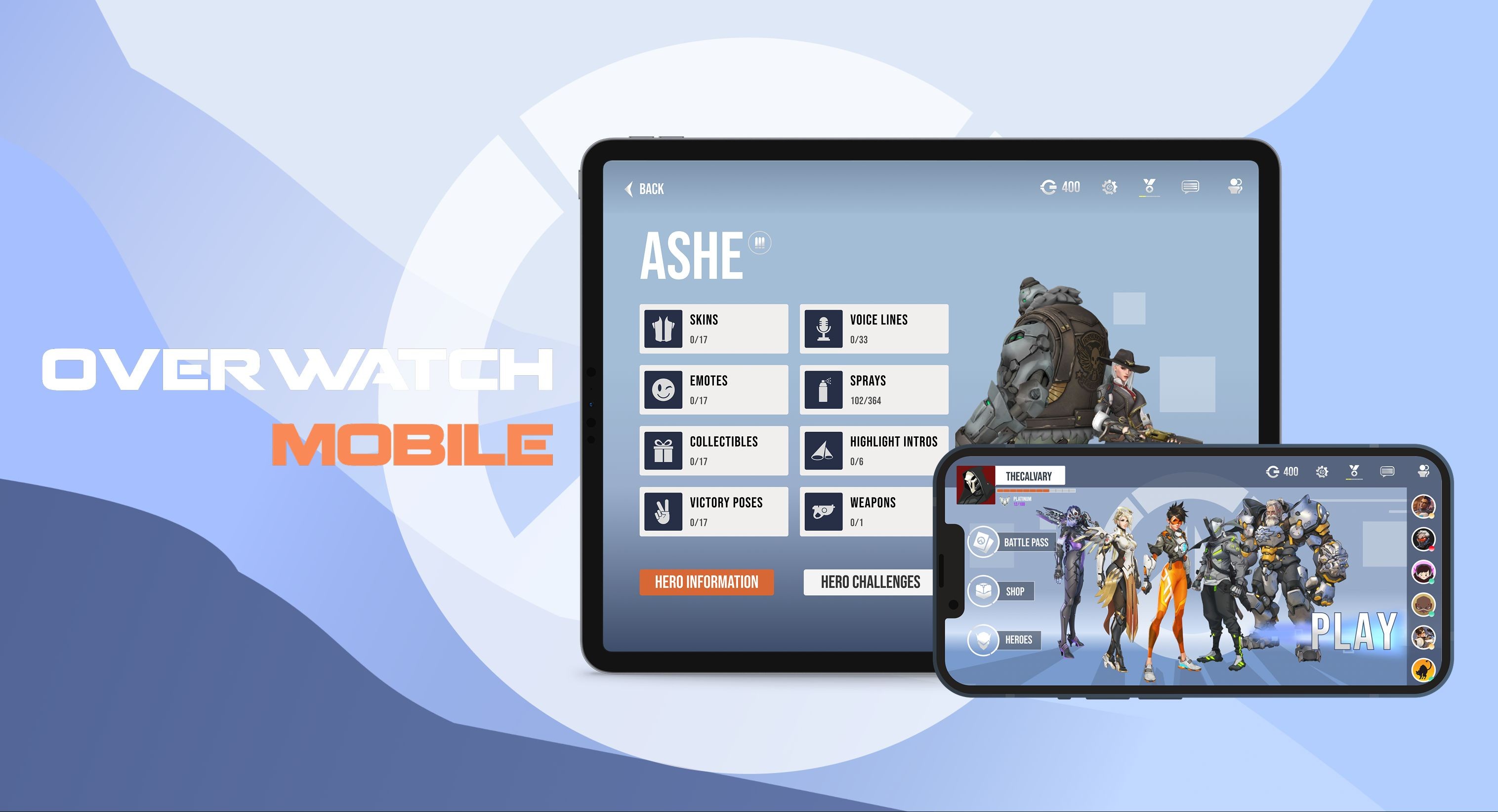
Overwatch 2 Mobile Redesign: Adapting to a mobile UI concept
Overwatch 2 was a highly anticipated sequel to the popular team-based multiplayer FPS hero shooter developed by Blizzard Entertainment. Players choose from a diverse roster of unique heroes and engage in 5v5 matches.
As a long-time fan, I initiated this project to explore and design a streamlined mobile interface for the game, addressing the critical challenge of adapting a complex desktop UI to a touch-based environment.
My process involved conducting research, defining player journeys, and executing a full design cycle—from wireframes and custom icons to high-fidelity prototypes.
Key Results & Value:
Information Architecture: Reduced information overload by dedicated zones for game data, leveraging tablet screen real estate effectively.
UX Adaptation: Optimized game functions (Shop, Gallery, Heroes) designing around touch and swipe gestures, ensuring usability.
Designer Growth: Elevated final design by implementing industry Senior Designer critique, refining Visual Hierarchy to improve player scan ability and reduce cognitive load.
Role
Product Designer
TEAM
timeline
11 Weeks
platform
Mobile Gaming
Tools
Figma
Illustrator
Photoshop
OBJECTIVE
How can features of the Overwatch desktop UI be adapted for tablet touchscreens? The design must retain overall game aesthetics and minimize information overload to player’s familiarity and engagement.
constraints
Defining the Design Scope
I narrowed down the project to three primary constraints, the focus should be on UI/UX adaptation rather than gameplay modification:
Visual Design
Maintain the visual style of Overwatch and replicate the overall design features and system of the game.
Experience Type
Creating the user journey of menus using mobile interfaces and experience.
Feature Integration
Convert key functions of the desktop game to mobile, rather than gameplay.
Flowcharts
Mapping the Player Journey
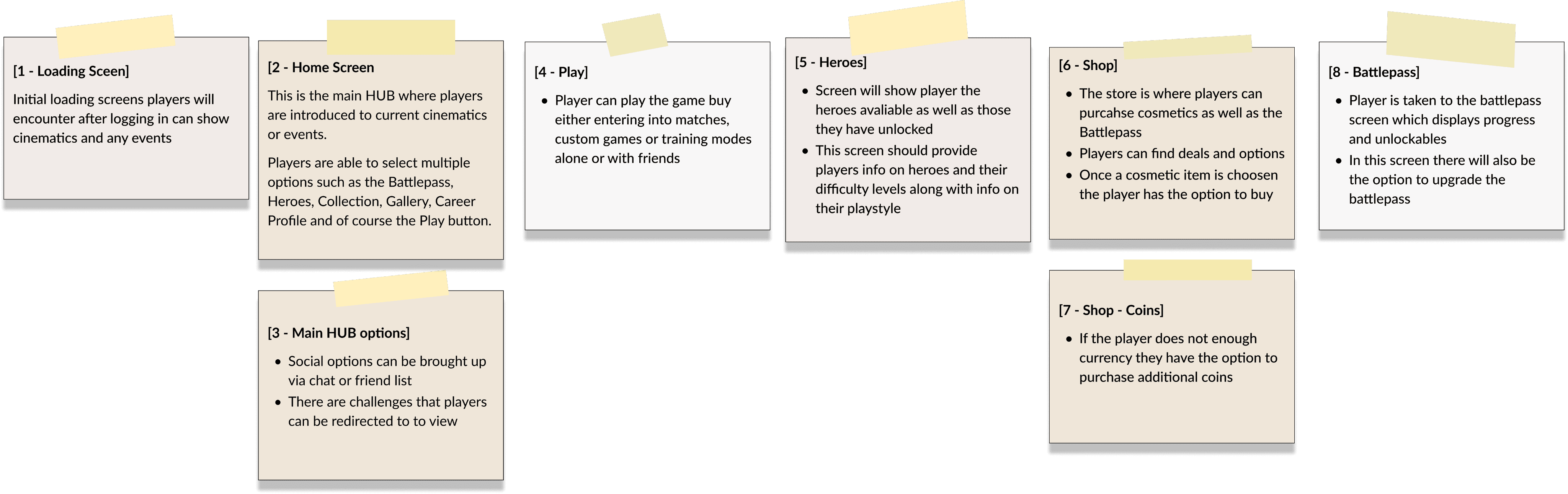
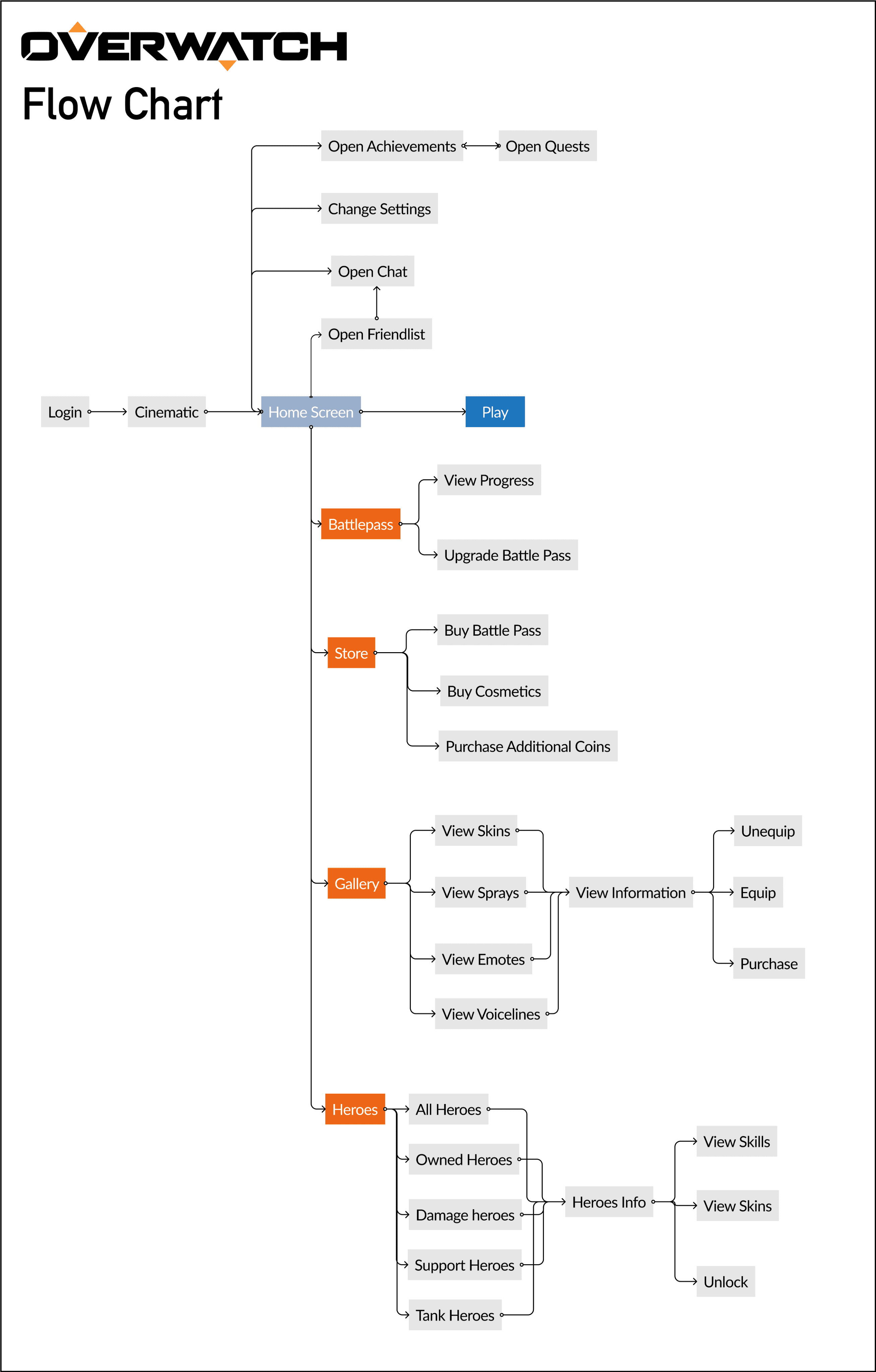
Going through the Overwatch experience I documented the different stages that a player will go through when interacting with the main screens. I used this as a guideline to help me translate a similar flow when creating the mobile experience.
Paper Flow
Flowchart
Key Results:
Streamlining Mobile Journey
The flowchart allowed me to deconstruct different flows and interactions that will be used as a foundation for the mobile interface and journey.
Wireframing & Iterations
Adapting the UI to a Tablet
For my sketches, brainstorming how to fit different menus, and buttons onto smaller screen sizes. I started off sectioning key UI elements of the screens, and button layouts for a mobile experience.
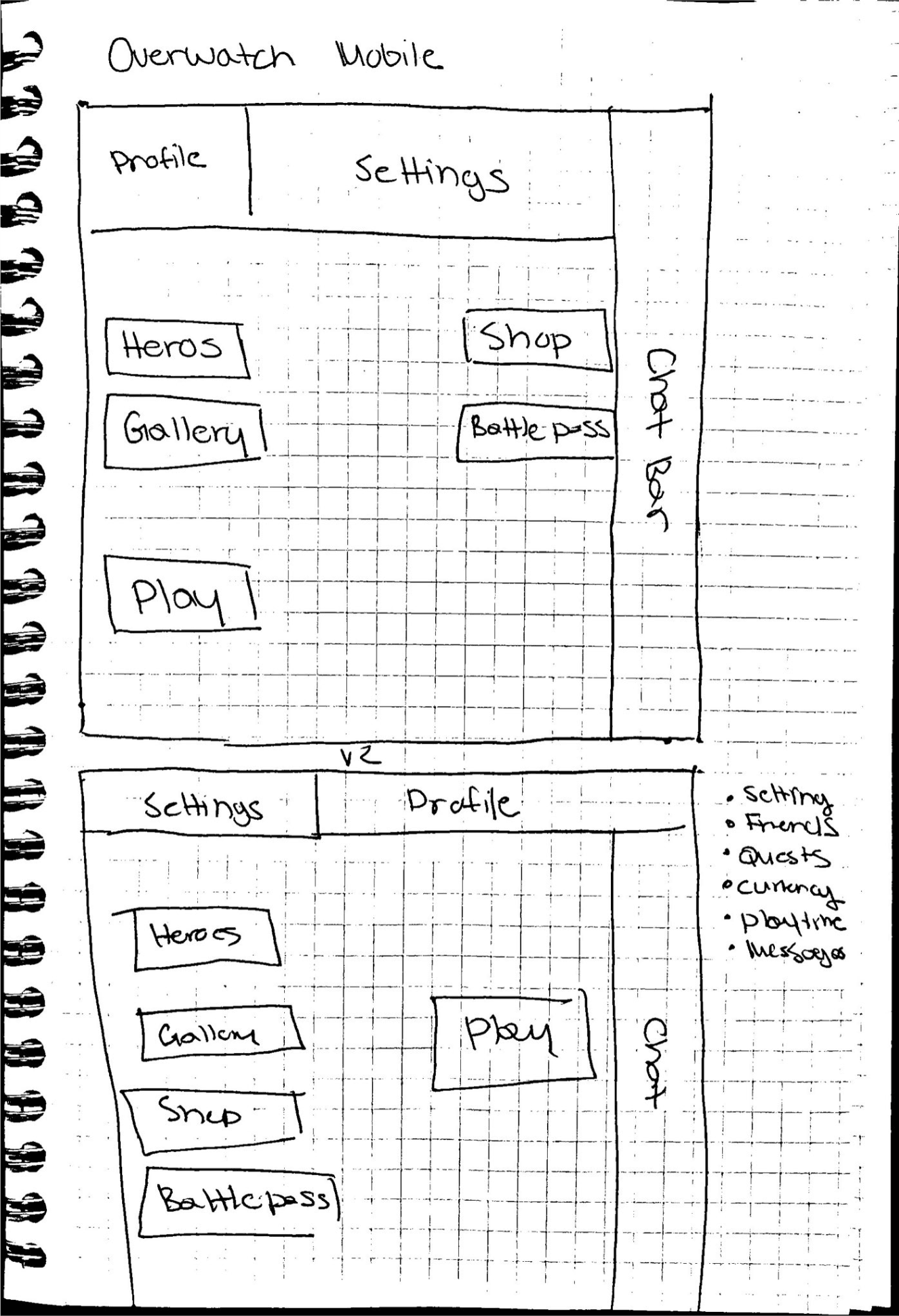
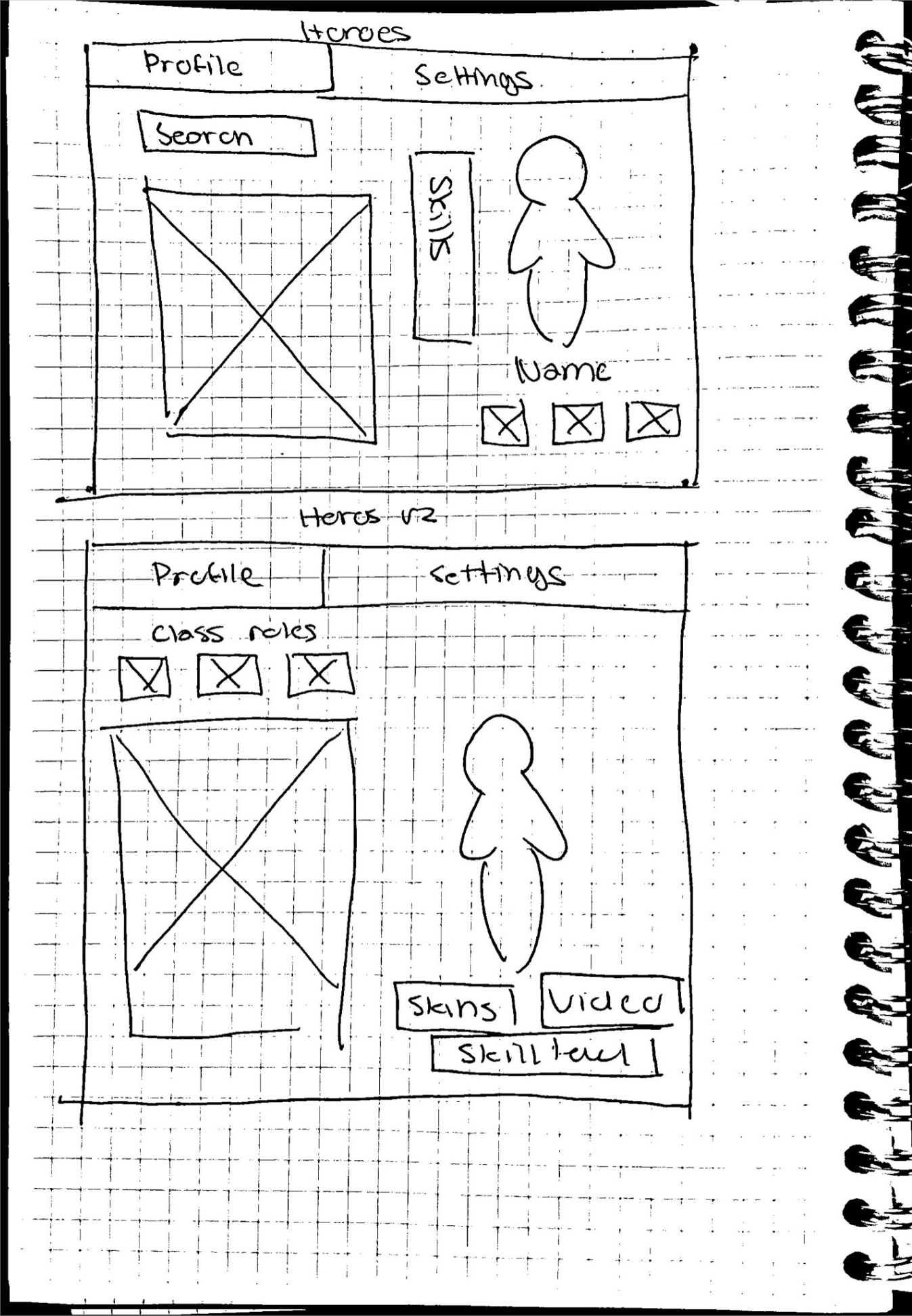
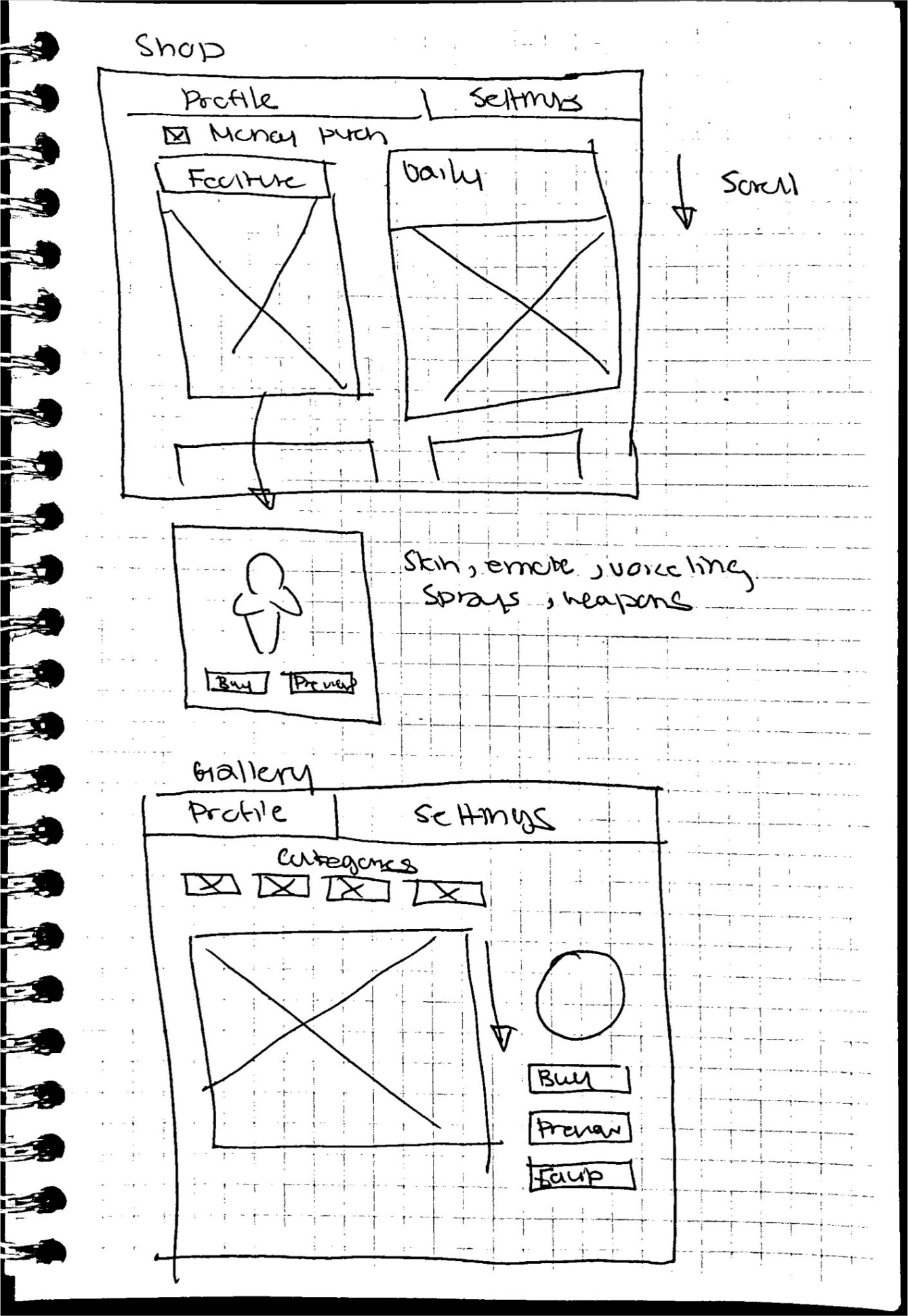
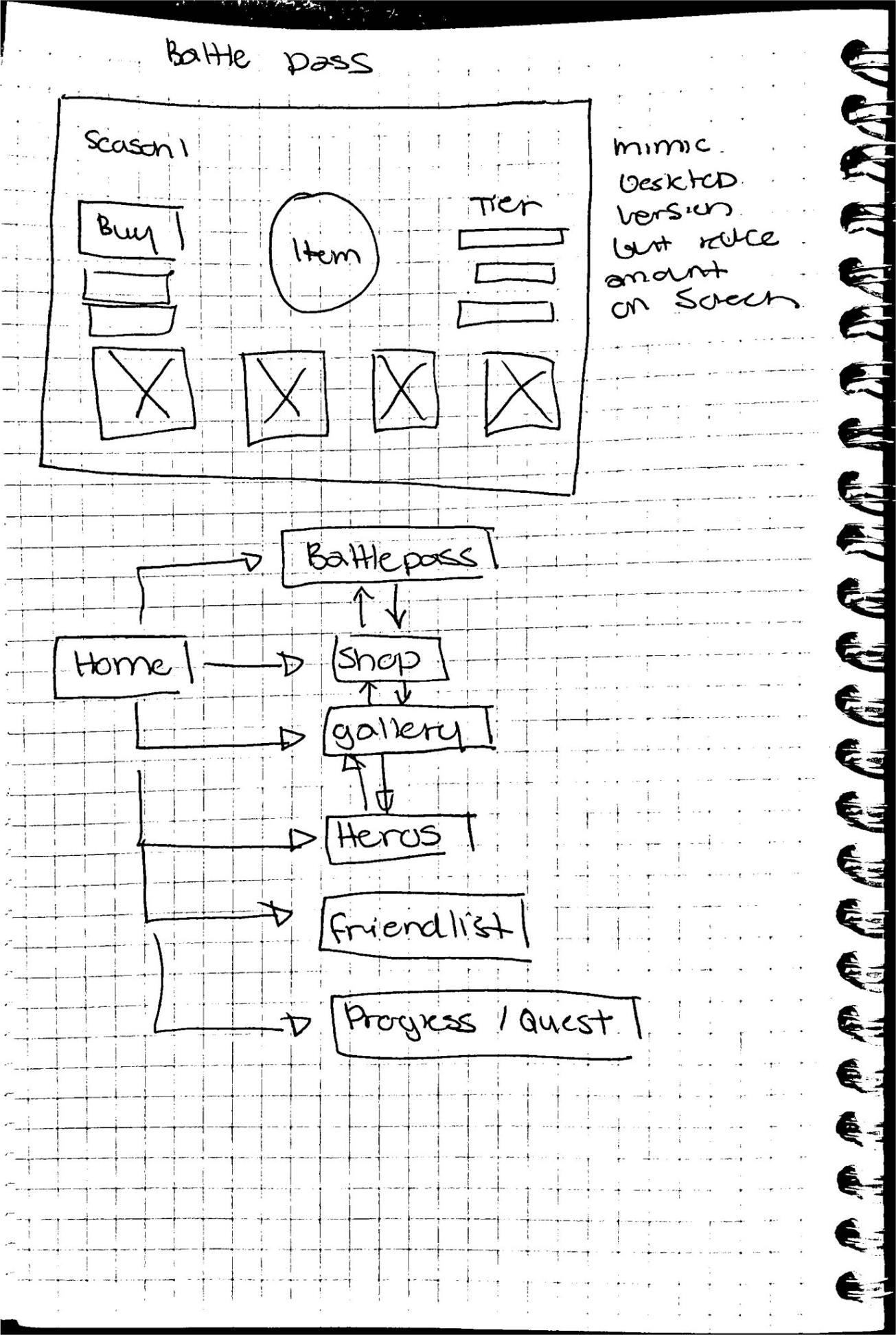
This process was guided by two goals: Maintaining familiarity with the desktop UI and minimizing information overload in a mobile UI.
Home / Battle Pass / Shop
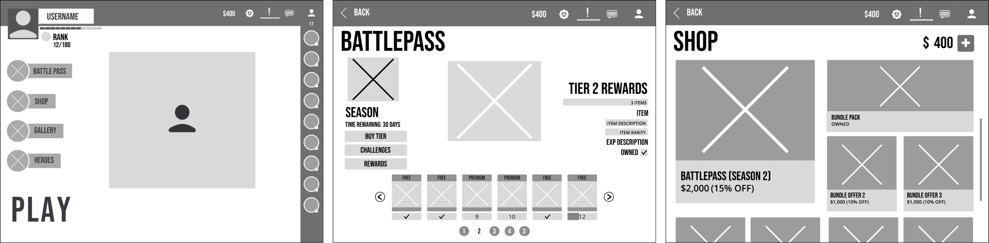
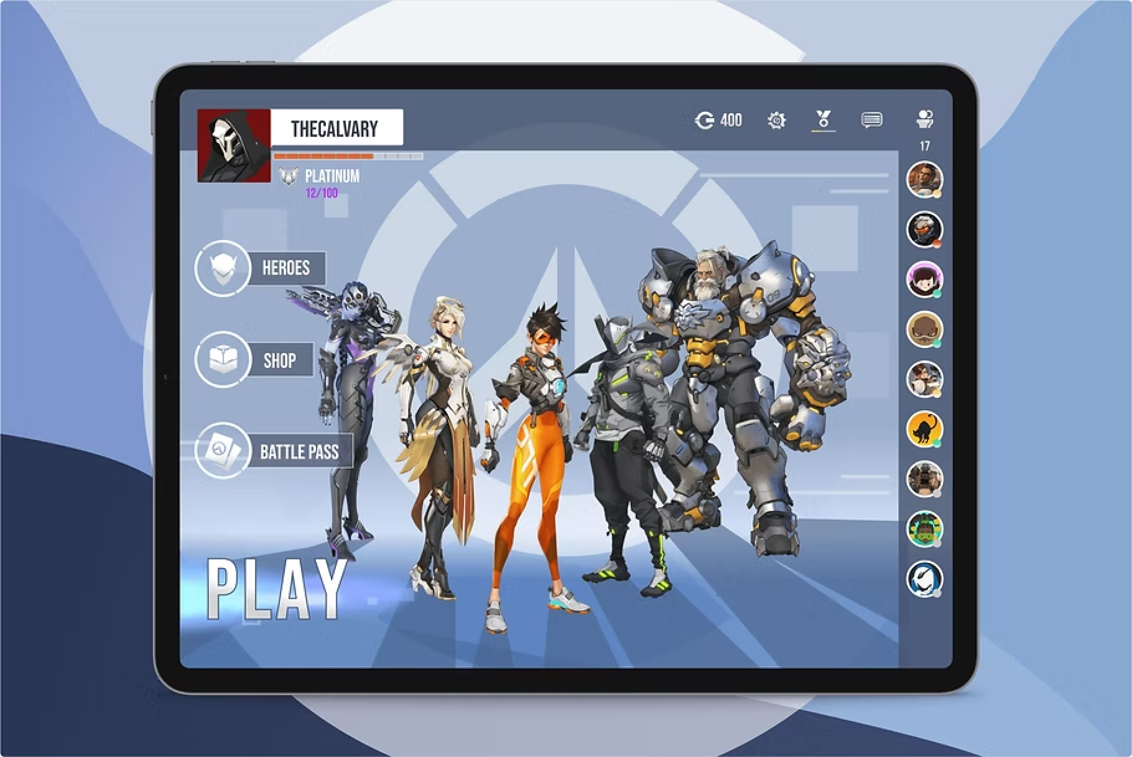
Home Screen: Minimized overload by creating zones: links (left), friends/chat (right), and settings/missions (top), keeping a similarity to the desktop UI.
Battlepass: Was more of a challenge due to the large amount of information required, requiring multiple iterations to work on smaller screen sizes.
Shop: Optimized for mobile using touch features (scrolling and tapping) for efficient browsing and item viewing.
Home / Battle Pass / Shop
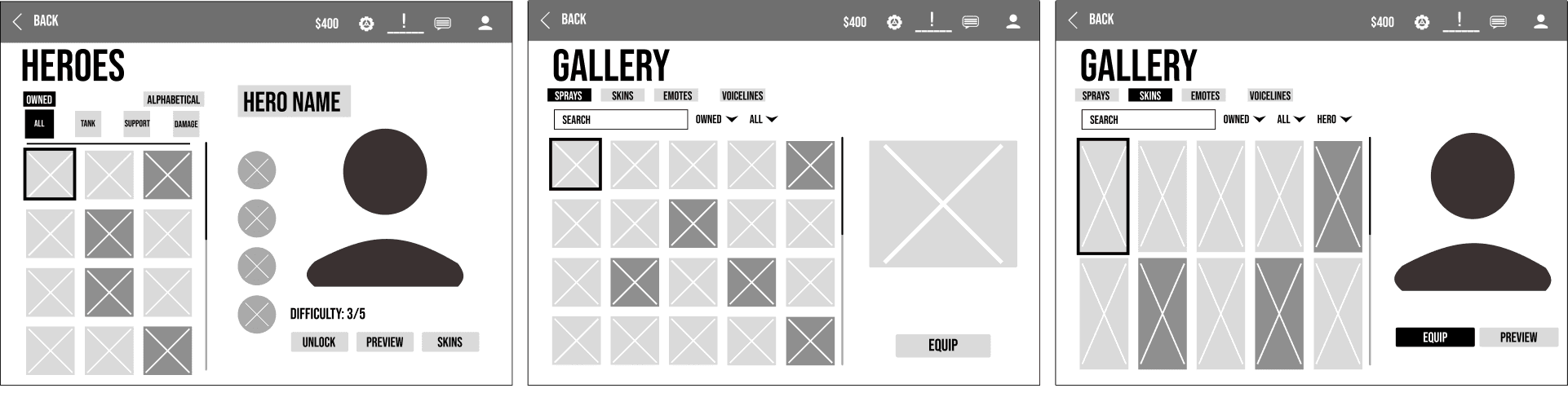
Gallery: Focused on intuitive navigation for content viewing. Implemented touch/swipe navigation and different filtering sections to ease browsing large amounts of information.
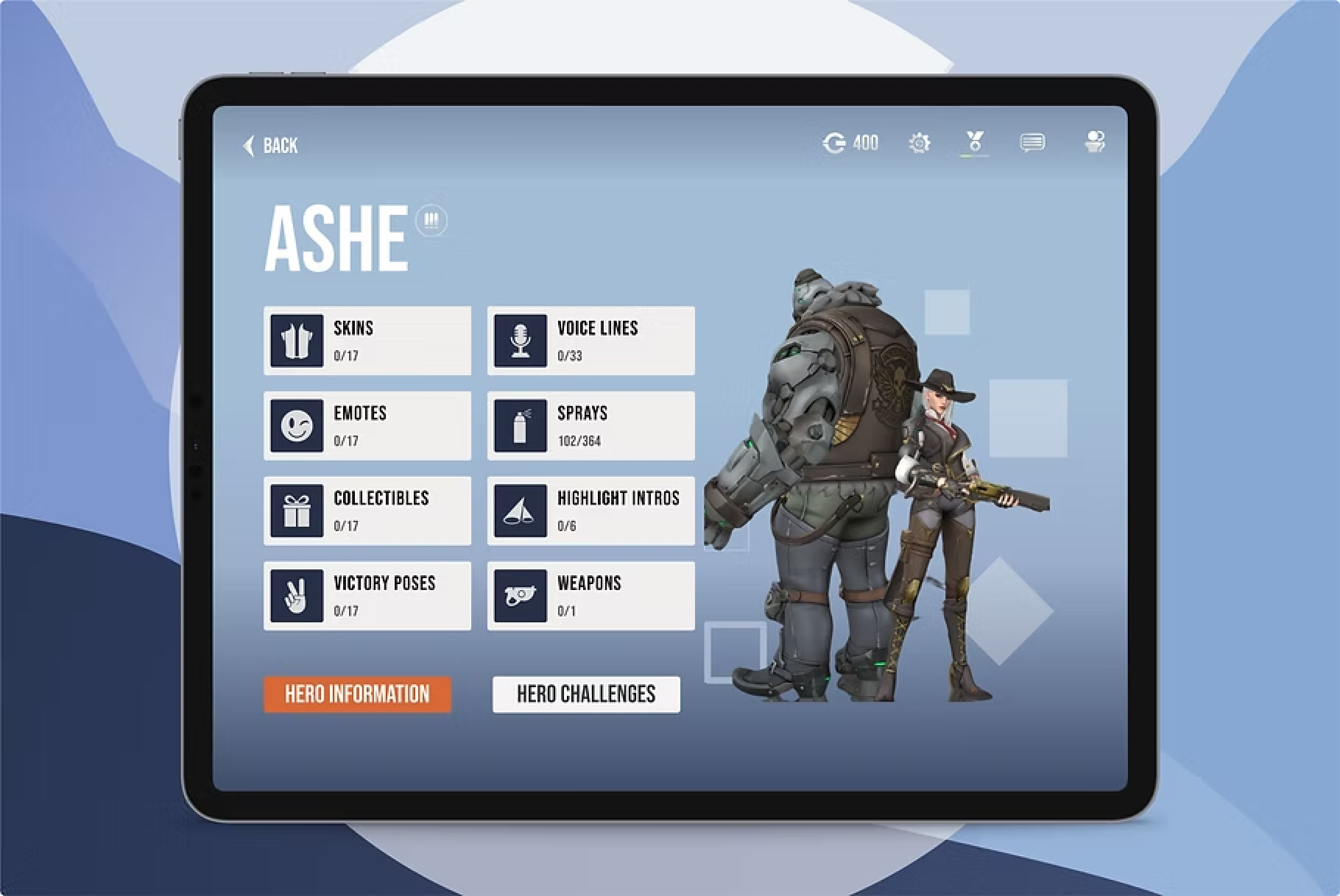
Heroes: Played around with different viewing of assets (heroes, skins, abilities). Using the filter system from gallery to manage information and improve the viewing experience.
Usability Test and Industry Feedback
Finalizing details of Designs and defending design decisions
During the wireframe process, I conducted a usability test with 10 different players who had prior experience with Overwatch and mobile gaming in general. The goal was to help validate if the tablet experience felt intuitive and aligned with player expectations.

Players, especially competitive ones noted the absence of the career page. Which players indicated was a key feature when measuring metrics, points and overall progress

Players adapted to the new UI, intuitively using touch and swipe gestures for navigation. The layout was noted to be comfortable if held as a tablet, and button placement was accessible.

Design Decision: Player feedback validated the general screen layout but required me to re-integrate the Career Profile into the final design architecture.
Update 2.0
Upon moving to high-fidelity designs, I sought out professional critique through a mentorship with a Senior Designer from the gaming industry to elevate the final product.
Impact of Feedback:
Improvement to Design:
The feedback I received was applied to polishing the design, leading to key revisions across the Player Flow, Visual Hierarchy, and Readability.
Designer Growth:
Industry feedback allowed me to refine my designs based on AAA game UX, ensuring I adhered to a higher standard of visual communication.
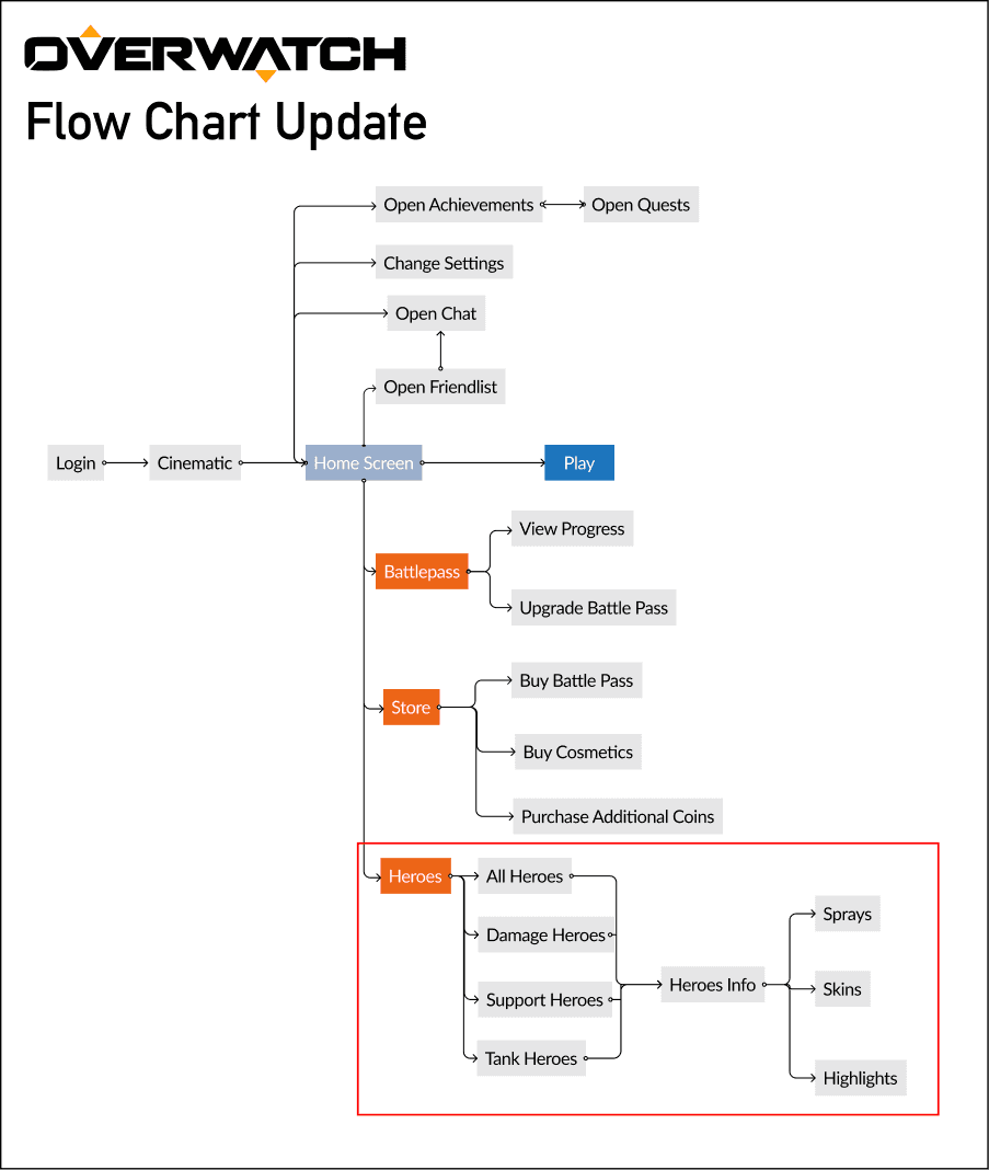
Updated player flow
Interactive Prototype
Bringing the Tablet UI to Life
The high-fidelity prototype showcases the final design which utilizes the touch-optimized tablet interface.
Home Screen
Shop
Heroes
Career Profile
Visual Design
Maintaining Brand Consistency on Tablet
My approach to the visual design was rooted in strict adherence to the Overwatch 2 aesthetic while ensuring all elements were optimized for the tablet form factor.
Moodboard
Combining Overwatch 1's UI with tablet interaction patterns from other games. This guided the visual design, ensuring the new interface felt familiar and functional on a larger touchscreen.

Iconography
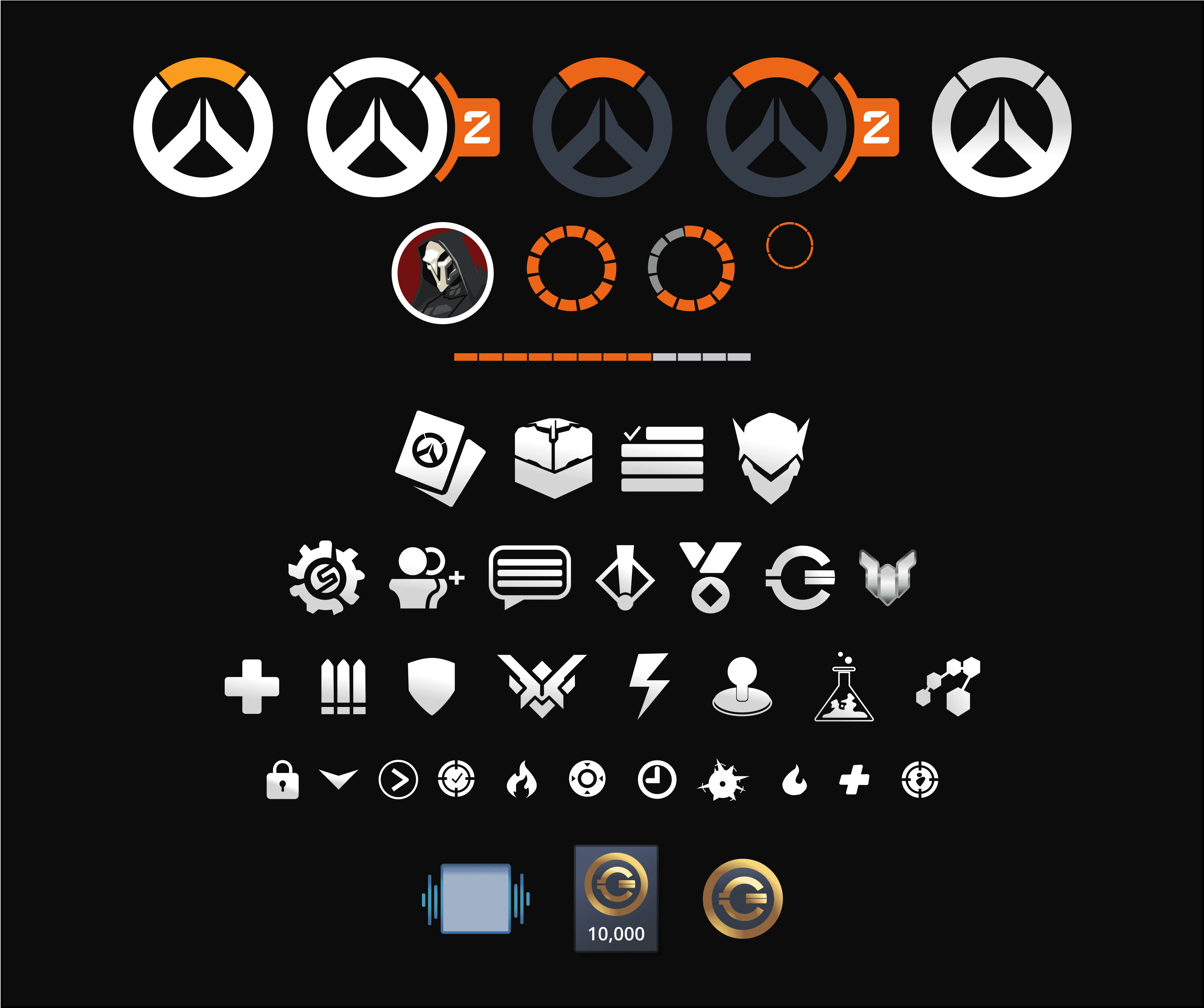
I set out to recreate icons that adhered to the existing Overwatch UI design system. Maintaining brand fidelity and ensuring visual consistency across all menus and features.
Typgraphy
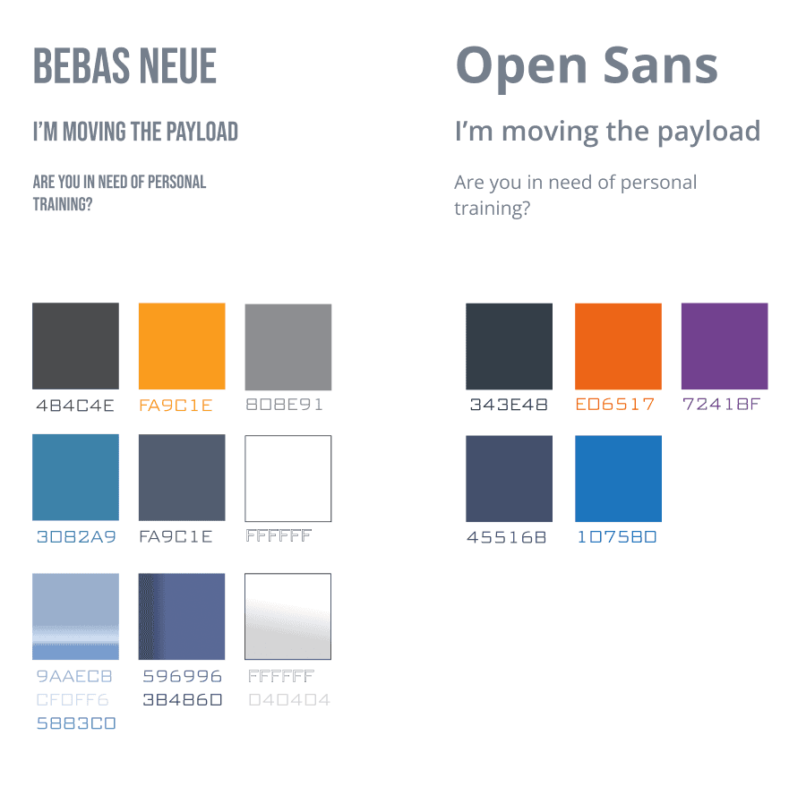
The typography and colour palettes were used to closely match to what Blizzard used in their designs.